
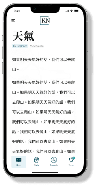
KnowNative is a language-learning platform that helps students of traditional Chinese improve reading comprehension through immersive, personalized study experiences. They had recently launched their demo for their web app, but it was designed exclusively for desktop use. To increase accessibility and broaden their reach, I was brought on to design responsive mobile and tablet versions.
Challenge
Improve KnowNative's demo experience by designing responsive prototypes that make the product accessible across devices and easier for users to engage with.
Outcome
Delivered tablet and mobile prototypes that allow users to explore the demo seamlessly from any device.
Created a scalable design system to support consistency and collaboration among team members throughout the project.
Role
UX, UI Designer
Time
16 weeks
Tools
Figma
Pencil and paper


These reflections made it clear that the current design assumes users have some existing knowledge of Chinese. While I had several ideas for new features, I prioritized translating the current experience responsively and documented my observations for future, research-backed improvements.


Toggling Side Navigation Bar
Since we already had the large window class built and prototyped, I began wireframing for the medium and small breakpoints.
For the medium layout, I explored how to adjust the sidebar and reading space to maintain legibility and balance. Because reading is central to the experience, I sketched different ways the sidebar could condense or shift to give the text more space.


While reviewing the prototypes, the stakeholder and I realized it was difficult to visualize how the side navigation would behave when collapsed, including where the toggle arrow should appear. To address this, we placed the toggle arrow directly beside the side navigation so users could easily find and reopen it, and we switched from a double-arrow icon to a single arrow to better match KnowNative's minimal visual style.


Layout Challenge

I discussed with the stakeholder, and later, in a team meeting (which I couldn’t attend), it was confirmed the developers were also unsure how to handle the transition. It was clear to me that the breakpoint ranges I had set weren't going to work. To resolve this, I further explored different breakpoint options and mocked up threshold variations.


We then chose Option A where the end of the large window class size would be at 907px and the beginning of the medium window class would start at 906px. Across the entire medium breakpoint, the main text would collapse and the side navigation would take full width. This simplified development and created a more consistent experience. Since this decision was made based on visual and technical preference, we agreed to conduct future user research to better understand how users interact with the app on different screen sizes.

Similarly to the medium window class. I explored a few different structure options to preserve the integrity of the existing desktop design. I referenced earlier concepts created by the UX designer that worked on the demo which gave me a strong foundation and inspiration to iterate from.


Adding/Deleting a Term


To ensure that my work was clear and easy to build on for both developers and future UX designers, I documented patterns, spacing, components, and interaction to help maintain consistency across screen sizes and streamline handoff. The image below is one of the many examples of how I recorded those iterations.

From a wireframe to prototype, I finalized my responsive designs for both the medium and small window class in preparation for handoff and user research.
Being new to working in a multidisciplinary team, design systems, and responsive prototypes, I learned a great deal throughout this project. I spent significant time researching design systems in Figma and best practices for responsiveness, and I'm proud of how those efforts informed the final outcome. I look forward to applying these skills in future projects.
Testing
Many of the design decisions were assumption-based, so usability testing would be the first priority to validate the interaction patterns and refine the responsive layouts.
Hand-off
After testing and iterating, I would prepare a developer hand-off with clear documentation, component specs, and responsive behavior guidelines.
Product Launch
Once developed, the product would be available across multiple devices, improving accessibility and expanding KnowNative's reach.
Future Features
After observing how users interact with the app, I would prioritize and design additional features that support their learning need and improve the overall experience.


